20D.40.40 Sign Design Standards.
20D.40.40-010 Purpose.
The purpose of this section is to establish criteria for signs and street graphics, including the type of sign, the sign message, color, and illumination. (Ord. 2164; Ord. 1993)
20D.40.40-020 Signs and Street Graphics.
(1) Intent.
(a) Signs should be used primarily for the purpose of identification or conveying recognition of a particular development.
(b) Signs should be consistent with building design and surrounding structures, and be appropriate to the type of activity to which they pertain. Design elements, such as the size, shape, materials, lighting, color, lettering style, and the number and arrangement of signs, should present a professional appearance and quality of permanence.
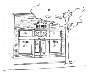
Figure 55: Sign Criteria (1)(b) and (1)(c) of this section.
This is an example of the sign designed to be compatible with the overall building.
(c) The shape of a sign should strive for simplicity with all elements constituting an integrated design with the building and landscaping.
(d) A sign must be legible.
(e) The scale of a sign should be in proportion with the building or site to which it pertains. Where multiple tenants are involved, signs should be proportionate to the size of the tenant space. For example, an anchor tenant can have the largest sign in a strip mall.
(f) The number of signs should be minimized in order to avoid visual clutter.
(g) Sign programs should be adhered to unless:
(i) Special circumstances can be substantiated for an individual tenant to deviate from the standard requirements.
(ii) Adherence would be out of character with a historic design subarea or a historic landmark.
(h) A sign should be an understatement in relation to the building and site the sign is identifying. Conversely, a sign should not overshadow its building or surroundings.
(i) For historic landmarks and the Old Town district, signs should be consistent with the historic character of the landmark and/or district, and should not obscure significant features.
(j) To ensure that sign scale, orientation and lighting are compatible with natural and aesthetic qualities of adjacent critical areas, shorelines, or other natural open space.
(2) Design Criteria.
(a) Sign Message.
(i) Signs should be used primarily for the purpose of identification, conveying recognition of a particular enterprise, group of enterprises, or franchise. The sign message shall be the name identification of the business. Project and service information may only be integrated into the primary signs as smaller, secondary copy.
(ii) The sign message, if oriented towards automobile traffic, should reflect the speed of traffic and the distance at which the sign is seen.
(iii) Use of easily recognized symbols, such as logos, is encouraged.
(iv) Signs may not advertise products or services in areas zoned for residential uses or in office and business parks.
(v) Signs should provide for good aesthetic presentation of the sign message through careful consideration of color combinations, illumination, sign placement, letter height, proportion and spacing, and by avoiding use of small and/or excessive lettering.
(vi) The shape of a sign should strive for simplicity with all elements constituting an integrated design.
(vii) The use of third-party advertising signs is prohibited unless the product or service advertised reflects a franchise or dealership identity.
(viii) The advertising content of signs should be simplified so that it does not detract from the identification purpose and the legibility of signs.
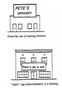
DON’T DO THIS
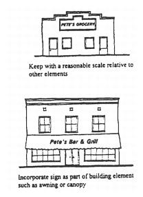
DO THIS
Figure 56: Sign Design Criteria (1)(b) and (1)(e) of this section.
(b) Color.
(i) Colors should be used which are complementary and restrained. Bright and brilliant colors should be avoided except for use as accent color. No specific color or combination of colors is prohibited.
(ii) Sign colors should be visible without being garish, and consideration should be given to the contrast between sign letters and their background.
(iii) Signs should be oriented to the roadway and not toward adjacent residential, recreational, or open space uses.
(iv) Franchises are subject to the same signage standards as other commercial uses, and are strongly encouraged to use the minimum amount of signage and building features to convey corporate identity.
(c) Illumination.
(i) Surface brightness or intensity of lighting should not be beyond that necessary for visibility from the public right-of-way.
(ii) Illumination should be appropriate to sign design.
(iii) Illumination should be energy efficient and should be arranged so the light source is shielded from view.
(iv) Signs should not produce a harsh, uncomfortably bright light, either through the level of illumination or a combination of illumination levels and design of the sign face.
(v) Signs shall not be overly bright so as to overshadow signs in the immediate vicinity, cause glare, or create an island of light.
(vi) Internally lit fascia, soffits or other building elements should be avoided. Such internally lit building elements incorporating corporate or franchise color schemes may be considered as part of the buildings sign program and therefore subject to the applicable sign standards.
(d) Wall Signs.
(i) The size and location of wall signs shall be reviewed in terms of their relationship to the building entry, height of sign fascia, or size of wall where the sign is to be installed and the relationship to other signs on a building, as well as visibility from the street, sidewalk or parking lot.
(ii) On multi-tenant buildings wall signs should be evaluated for compatibility as part of a sign program with the building fascia and neighboring signs in terms of size, color, lighting materials, sign style, and quality.
(iii) The depth of wall signs on multi-tenant buildings should be consistent.
(e) Freestanding Signs.
(i) Freestanding signs shall be of a style, material, and design compatible with the associated building.
(ii) Berming shall not be used to exceed the maximum allowable height of signs.
(iii) The base or support elements of freestanding signs should be integrated with the surrounding environment. Landscaping may be required to buffer such signs.
(iv) Freestanding signs should be sited so that they integrate with the location of street trees and other site landscaping, and to avoid obscuring the view of adjacent freestanding signs.

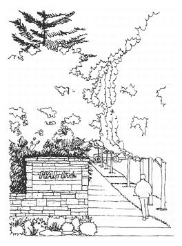
Figure 57: Sign Criteria (2)(e) of this section, Freestanding Signs.
Simplicity and quality materials make this a successful sign design.
(Ord. 2486; Ord. 2302; Ord. 2164; Ord. 1993)


