Chapter 19.49
Old Burien Design Standards Revised 2/25
19.49.010 User Guide Revised 2/25
19.49.020 General Revised 2/25
19.49.030 Building Location and Orientation Revised 2/25
19.49.040 Service, Loading, Outdoor Storage and Mechanical Areas
19.49.050 Pedestrian Amenities
19.49.060 Parking Area and Driveway Location and Design
19.49.080 Architectural Style / Character
19.49.090 Building Scale and Mass
19.49.100 Building Details and Materials
19.49.010 User Guide Revised 2/25
This chapter establishes design standards for the Old Burien Overlay, as illustrated in Figure 1. If you are interested in developing or making changes to property within the Old Burien Overlay, you should read this chapter, along with applicable zoning regulations in Chapter 19.15 BMC.
Words within the standards and guidelines that are italicized are defined in the Definitions portion of the zoning code found in Chapter 19.10 BMC. [Ord. 849 § 62, 2024]
19.49.020 General Revised 2/25
1. Purpose and Intent.
These guidelines are intended to direct the design of buildings and sites within Old Burien, in compliance with the City’s Zoning Code and Comprehensive Plan. The guidelines will promote quality development and reinforce Old Burien’s early 20th century “main street” character -a vision of an attractive, pedestrian-oriented environment with a small town atmosphere. Buildings and sites should convey a sense of permanence, attention to detail, quality and investment. The guidelines are not intended to slow or restrict development, but rather to add consistency and predictability to the permit review process.
2. Compliance with Design Standards.
For each element below, a design objective or end result of what is intended to be achieved is stated. The design objective shall be complied with. Following each objective are a series of design standards. There are two types of design standards. Some design standards are viewed as fundamental in achieving the stated design objective(s). These standards are mandatory. In these statements, the word “shall” is used. The second type of design standard are examples or alternatives to achieving the design objectives. In these standards, the words “should” or “may” are used, or “shall”, “must” or “should” are not used. In standards where neither “shall” or “must” nor “should” or “may” are used, there is an obligation to comply with the standard, unless the project demonstrates a better means for achieving the design objective.
The applicant shall demonstrate to the satisfaction of the Director that the applicable objectives and design standards are met.
3. Review Process.
BMC 19.65.105 contains procedures for compliance with this Chapter.
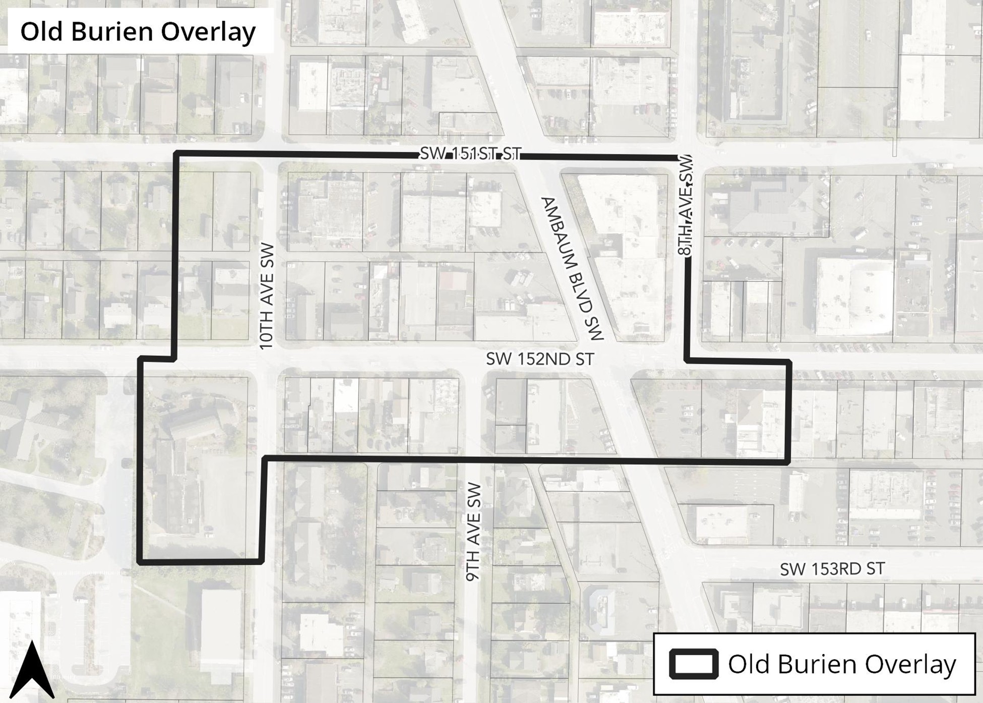
Figure 1. Properties in the white area are subject to the design standards herein.
[Ord. 849 § 63, 2024]
19.49.030 Building Location and Orientation Revised 2/25
1. Objectives.
A. Reinforce and preserve the historic character of Old Burien.
B. Reinforce the pattern of small storefronts along SW 152nd Street.
C. Create an active and safe pedestrian environment by encouraging street oriented development.
D. Create visual interest and increased pedestrian activity at street corners.
E. Reduce the impact of parking lots and blank walls on adjacent streets.
2. Design Standards.
A. All buildings, unless otherwise noted, may be placed at the sidewalk’s edge provided they include a pedestrian-oriented facade. This includes:
i. Primary building entry on this facade.
ii. Transparent windows and doors covering at least 75% of the facade between 2 and 8 feet above the ground.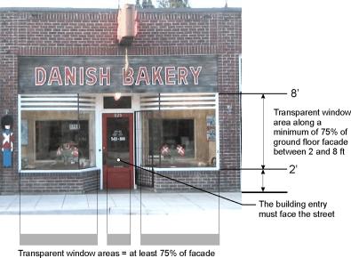
Figure 2. Many of Old Burien’s storefronts exhibit “pedestrian-oriented facades.”
Exceptions to subsection (ii) of this section:
a. The transparency requirement may be reduced by 50% for all public uses (meaning that transparent windows and doors must cover at least 37.5% of the facade between 2 and 8 feet above the ground), including municipal facilities and museums provided the building treatments meet the intent of the standards.
b. In lieu of transparent windows, display cabinets showing products or features relating to the use of the building may be used for up to 50% of the transparency requirement (up to 37.5% of the facade between 2 and 8 feet above the ground) provided the treatments meet the intent of the standards.
B. SW 151st and 152nd Streets east of 10th Avenue SW. All buildings must feature a pedestrian-oriented facade facing the street. Such buildings must be placed at the sidewalk edge, except:
i. To allow for wider sidewalks.
ii. If the area between the sidewalk and the building meets the definition of pedestrian – oriented space (see Figure 4).
iii. If the area between the sidewalk and the street is maintained as a landscaped area (excluding required pedestrian access areas) with plantings that add seasonal color and interest and do not act as a visual barrier (see Figure 5).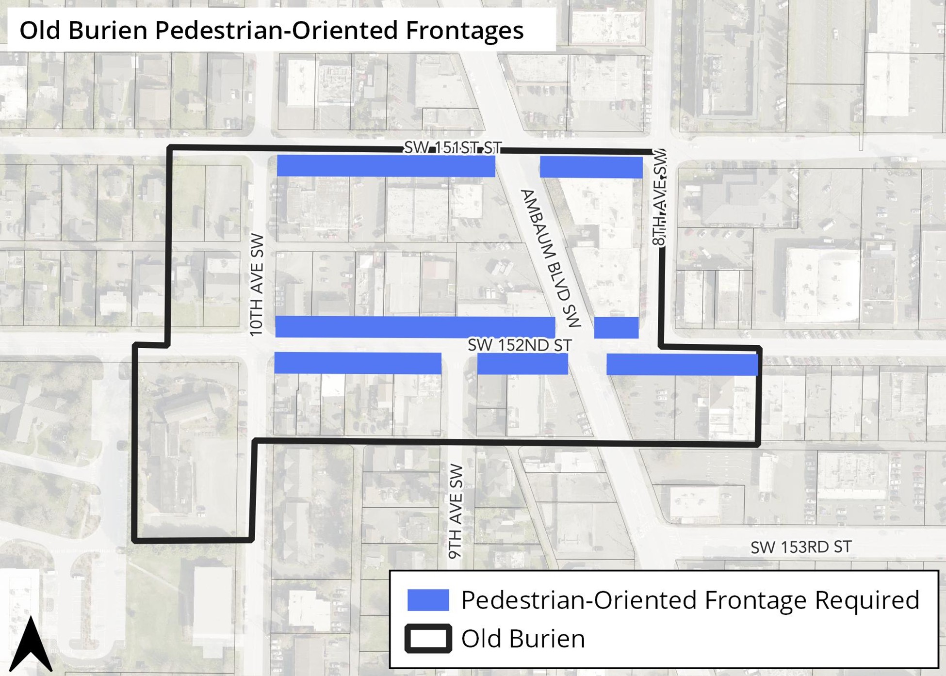
Figure 3. The 151st and 152nd Street frontages, highlighted in black, require pedestrian-oriented facades adjacent to the sidewalk (with noted exceptions).
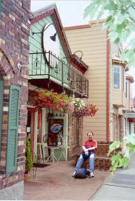
Figure 4. Building setbacks on 151st and 152nd Streets, east of 10th Avenue SW, may be allowed if the space between the sidewalk and the building is maintained as a pedestrian-oriented space.
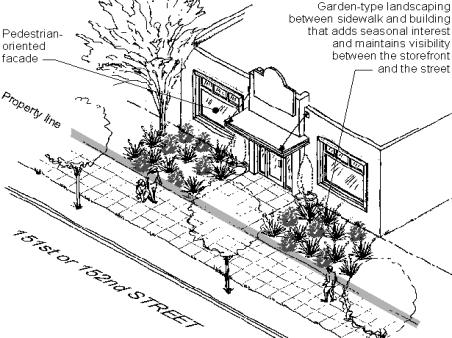
Figure 5. Building setbacks on 151st and 152nd Streets, east of 10th Avenue SW, may be allowed if the space between the sidewalk and the building is maintained as a landscaped area (except for required pedestrian access).
C. Buildings not featuring a pedestrian-oriented facade, where allowed, must be set back at least 5 feet from the back of the sidewalk. The area between the sidewalk and any such building must be landscaped or designed as a pedestrian-oriented space. The applicant must demonstrate how the landscaping and/or other design treatments meet the Building Location and Orientation Objectives.
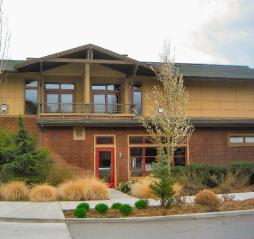
Figure 6. Buildings that do not contain pedestrian-oriented facades must be set back from the sidewalk at least 5 feet and contain pedestrian-oriented space or landscaping (such as this) between the sidewalk and the building. Note how landscaping in this example mitigates the blank wall to the left but allows for visibility between windows and the street.
D. Buildings on SW 152nd Street west of 10th Avenue SW shall include a 10' minimum landscaped setback from the street to reinforce the pattern of landscaped front yards to the west. Shrubs and trees blocking visibility between the ground floor entrance, windows, and the street shall be avoided.
Figure 7. If redevelopment occurs on properties on SW 152nd Street west of 10th, a 10' minimum landscaped setback shall be provided to reinforce the character of landscaped front yards here.
E. Street corner sites. All buildings located at the intersection of streets shall be located within 15 feet of the street corner (larger setbacks will be permitted where the space between the street and building meets the definition of pedestrian-oriented space) and are encouraged to orient the primary entrance to the corner. Cropped or notched building corners for small pedestrian-oriented spaces adjacent to the street corner are encouraged.
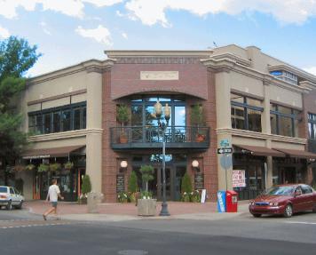
Figure 8. Street corner buildings are encouraged to orient the primary entrance to the corner.
F. If the public sidewalk is less than the width shown in the Downtown Burien Streetscape Design Plan, the building should be set back sufficiently to provide for the walking surface and/or space to provide optional finishes shown in the Burien Downtown Streetscape Design Plan to enhance pedestrian safety and enjoyment. For those streets not specified in the Burien Downtown Streetscape Design Plan, developments must set their buildings back to provide for the following sidewalk widths. Additional sidewalk width may be achieved by sidewalk easements or dedication of property for public right-of-way:
i. SW 151st Street and 9th and 10th Avenues SW: 10' sidewalks.
ii. Ambaum Blvd SW: 10' sidewalks.
G. Principal pedestrian building entries must have direct access to the adjacent public sidewalk. [Ord. 849 § 64, 2024]
19.49.040 Service, Loading, Outdoor Storage and Mechanical Areas
1. Objectives.
A. Minimize adverse visual, olfactory, or auditory impacts of service, loading, outdoor storage and mechanical equipment areas at ground and roof levels.
B. Encourage more thoughtful siting and reduce impacts of service, outdoor storage and mechanical areas.
2. Design Standards.
A. Landscaping or other forms of screening shall be provided around outdoor service, storage, loading and mechanical areas, utility meters, electrical conduit, and other service and utilities apparatus to provide sensory (visual, olfactory, auditory) screening from adjacent properties, streets, affected pedestrian circulation routes, and affected pedestrian-oriented spaces.
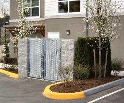
Figure 9. Where service elements are visible to the public, they should be screened. This example includes landscaping and masonry to mitigate impacts on the visual environment.
B. Outdoor storage areas and loading facilities shall be integrated into the site design to minimize their size, reduce visual impact, and where appropriate allow for pedestrian and vehicular movement between sites.
C. No large outside item display areas are permitted (e.g. kitchen appliances or other similarly large merchandise that is visible from the street). Sidewalks shall not be enclosed as building space for retailing. Outdoor dining and small, temporary displays for items such as groceries, hardware, books, etc. may be allowed provided they do not impede pedestrians passing comfortably on the sidewalk.
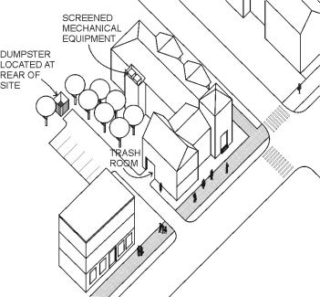
Figure 10. Locate service areas to minimize impacts on the pedestrian environment.
D. Dumpsters, refuse and recycling containers shall not be visible from the sidewalk and adjacent properties. They shall be screened by minimum 6’ high masonry enclosures designed to screen refuse containers, including lids, and refuse stacked in containers. Chain link fencing with slats may be used for gates but not for the enclosure. See Figure 9
E. Mechanical equipment shall be located and screened at ground level and attached to structures to reduce visual impacts from streets and adjoining properties.
F. Roof mounted mechanical equipment shall be located and screened so that the equipment is not visible when viewed from ground level of adjacent properties. The color of roof mounted equipment shall be screened or matched with the exposed color of the roof to minimize visual impacts when roof mounted equipment is visible from nearby buildings and higher elevations.
G. Service areas shall be located and screened to reduce adverse sensory impacts.
H. Utility meters, electrical conduit, and other service and utilities apparatus shall be located and screened so as not to be visible from adjoining and nearby streets.
19.49.050 Pedestrian Amenities
1. Objectives.
A. Enrich the pedestrian environment and encourage pedestrian activity.
2. Design Standards.
A. Developments are encouraged to incorporate pedestrian-oriented space into the design of the site. Desirable locations for pedestrian-oriented space are:
i. Between the sidewalk and the building entrance.
ii. Adjacent to the street corner.
iii. Adjacent to a building’s secondary entrance.
Note: Specific design requirements and recommendations for “pedestrian-oriented spaces” are provided in BMC 19.10, Definitions. For example, there are a number of design elements that are required in order for open spaces to qualify as a pedestrian-oriented space. Likewise, there are other features that are encouraged and a list of features that are prohibited in pedestrian-oriented space.
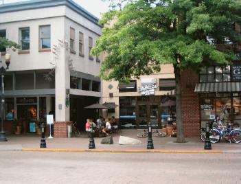
Figure 11. An example of a pedestrian-oriented space.
19.49.060 Parking Area and Driveway Location and Design
1. Objectives.
A. Provide safe, convenient access to and within sites without diminishing quality pedestrian walking or visual experiences.
B. Minimize driveway impacts across pedestrian walks.
C. Meet the need for adequate parking and minimize the negative effects of the automobile while encouraging transit and other forms of transportation.
D. Minimize visual impacts of parking structures on streets and pedestrian-oriented facilities.
2. Design Standards.
A. New driveways onto any street are prohibited. Access to all off-street parking areas shall be from existing alleys. Parking or other vehicular access areas between the sidewalk and the building are prohibited. Exceptions:
i. Ambaum Boulevard, where there is no public alley access between SW 151st and 152nd Street. Where possible, existing driveways along this block should be consolidated to the extent possible and may be required by the Director. Preferably, the alley should be extended to Ambaum Boulevard in conjunction with redevelopment activity.
ii. Existing driveways may be reconfigured provided the associated improvements bring the driveway and the development as a whole closer into conformance with the design standards herein. In reconfiguring existing driveways, the applicant shall consider use of the existing alleyways in lieu of maintaining an access from a public street.
B. Parking lots adjacent to any street must comply with BMC 19.25.070 Perimeter Landscaping standards.
Exception: The Director may eliminate or reduce the landscaping buffer requirement provided the applicant incorporates a decorative screen wall or low wall that incorporates landscaping sufficient to mitigate the visual impact of the parking area on the street. All such treatments must maintain maximum visibility at eye level between parking area and sidewalk. For instance walls or hedges should be limited to 3 feet in height and the underside of tree canopies should be trimmed up to 8 feet. (see Figure 12)
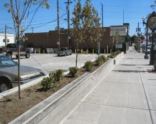
Figure 12. A screen wall example that incorporates landscaping. Note how visibility is maintained at eye level between the parking area and the sidewalk.
C. On SW 151st street, no more than 65’ of the street frontage (measured parallel to the curb) shall be occupied by surface parking and driveways. The Director may waive or modify this requirement for public safety purposes or if there is no feasible alternative. If a waiver or modification is granted, the design shall incorporate measures such as decorative screens along the street frontage. Such decorative screens shall include pedestrian amenities and visual continuity with structures that define the street edge along the street frontage.
D. Restricting vehicular and pedestrian access between adjoining parking lots at the same grade is prohibited.
E. The bulk (or mass) of a parking structure as seen from the street should be minimized by placing its short dimension along the street edge. Where adjacent to the street, the parking structure should include active uses such as retail or other appropriate uses along the street frontage.
F. Parking structures visible from a public street shall be architecturally compatible with exterior architectural elements of the primary structure. Parking structures, particularly those built to serve pre-existing buildings, don’t need to mimic the primary structure, but should utilize design features to make the structure compatible and complementary to the primary structure. Techniques could include facade treatments, use of finishing materials, fenestration, or massing techniques. Where technical requirements of the structure make it difficult and cost prohibitive to create a garage compatible with, for example, an early 20th century building, then alternative materials consistent with 20th century buildings may be used (including but not limited to brick and stone).
G. Buildings built over parking should not appear to “float” over the parking area, but should be linked with ground level uses or screening. Parking at grade under a building is discouraged unless the parking area is completely enclosed within the building or wholly screened with walls and/or landscaped berms.
H. Parking structures and vehicle entrances should be designed to minimize views into the garage interior from surrounding streets. Methods to help minimize such views may include, but are not limited to landscaping, planters and decorative grilles and screens.
I. Security grilles for parking structures shall be architecturally consistent with and integrated with the overall design. Chain link fencing is not permitted for parking structure fencing.
J. New parking lots shall not be located adjacent to intersections. Exceptions may be granted where alterative site configurations can more successfully meet the objectives of Site Planning and Pedestrian Access, Amenities, and Open Space Standards and Guidelines. Such parking areas must incorporate at least one of the following design treatments to add seasonal interest and reduce the visual impact of the parking lot on the street:
i. Install substantial decorative landscaping (at least 200 square feet of area adjacent to the street corner) utilizing a combination of decorative ground cover, shrubs, and/or trees.
ii. Install a trellis or other similar architectural element that incorporates landscaping.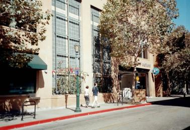
Figure 13. An example of minimizing the impact of a parking garage on the street: a) The entry is placed on the side street; b) space for ground floor retail is included along most of the street front (left side of photo); c) a decorative trellis and other architectural features effectively screen blank walls of the garage.
19.49.070 Site Lighting
1. Objectives.
A. Encourage the use of lighting as an integral design component to enhance buildings, landscaping, or other site features.
B. Encourage night skies’ visibility and reduce the general illumination of the sky in Burien.
C. Screen light fixtures so that the light source is not visible off-site.
D. Reduce horizontal light glare and vertical light trespass from a development site onto adjacent parcels.
E. Encourage the judicious use of lighting in conjunction with other security methods to increase site safety.
F. Discourage the use of lighting for advertising purposes.
G. Provide adequate lighting levels in all areas used by pedestrians or automobiles, including building entries, walkways, parking areas, circulation areas, and other open space areas.
2. Design Standards.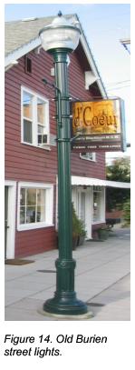
A. All public areas should be lighted with minimum and maximum levels as follows:
i. Minimum (for low or non-pedestrian and vehicular traffic areas): 0.5-foot candles
ii. Moderate (for moderate or high volume pedestrian areas): 1-2 foot candles
iii. Maximum (for high volume pedestrian areas and building entries): 4-foot candles
B. Lighting should be provided at consistent levels, with gradual transitions between maximum and minimum levels of lighting and between lit areas and unlit areas. Highly contrasting pools of light and dark areas shall be avoided.
C. Parking lot lighting fixtures should be non-glare and mounted no more than 25 feet above the ground. All fixtures over 15 feet in height shall be fitted with a full cut-off shield.
D. Pedestrian-scaled lighting is encouraged in areas of pedestrian activity. New pedestrian scaled lighting in the right of way should be consistent with the existing street lights in Old Burien (see Figure 14) as set forth in the Burien Street Standards.
E. Lighting shall enable pedestrians with normal vision to identify a face 15 yards away in order to promote safety.
F. All building mounted lights should be directed onto the building itself and/or the ground immediately adjacent to it. The light emissions should not be visible above the roofline of the building
G. Building mounted light fixtures should be consistent with the early 20th century theme of Old Burien.
19.49.080 Architectural Style / Character
1. Objectives.
A. Design buildings that reflect a traditional early 20th century main street character. Traditional main street character refers to a collection of structures designed and built in the early twentieth century when structures were composed of simple forms expressed through commonly available materials such as brick and timber.
B. Design buildings to reinforce Old Burien’s pattern of small-scale storefronts.
C. Encourage building design that has visual character and creates human environments.
D. Encourage developments to employ desirable architectural features found in historical Old Burien buildings without promoting a false sense of historicism.
2. Design Standards.
A. Applicants should base a building’s architectural character on building elements and form common to early 20th century Old Burien structures. These structures feature simple three-dimensional building forms expressed through commonly available materials such as brick and timber. Desirable building elements for commercial structures are shown in Figure 15. Applicants may consider modern interpretations of these building elements and components in a way that meets the guidelines herein and complements the surrounding context.
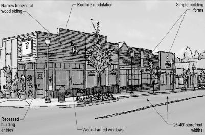
Figure 15. New buildings should base their architectural style on building elements and form common to early 20th century Old Burien structures.
B. Large or multiple building developments should employ a variety of colors, building materials, and architectural treatments at no more than 40 foot intervals to reduce monotony and reinforce Old Burien’s sense of scale and character.
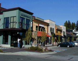
Figure 16. An example of developments that employ a variety of colors, building materials, and architectural treatments to reduce monotony and add visual interest.
C. Architecture that is defined predominately by corporate identity features (and difficult to adapt to other uses) is prohibited. For example, some fast food franchises have very specific architectural features that reinforce their identity; these buildings are undesirable because they can dilute a town or neighborhood’s identity with corporate (and therefore generic) identities, and are not adaptable to other uses when the corporate franchises leave. Prototype design for franchises should use customized components that are consistent with the desired traditional main street character and that reinforce visual consistency with other adjacent buildings.
19.49.090 Building Scale and Mass
1. Objectives.
A. Encourage the use of building components that are human scale.
B. Encourage architectural scale of development that is compatible with Old Burien structures.
C. Enhance the character and identity of Old Burien and add visual interest.
2. Design Standards.
A. The facades of all buildings facing SW 151st and 152nd Streets must include modulation and/or articulation features every 40 feet or less to reinforce Old Burien’s pattern of small storefronts. For facades facing other streets, the maximum interval shall be 60 feet. At least three of the following methods must be employed:
i. Use of window and/or entries that reinforce the pattern of small storefront spaces.
ii. Use of weather protection features that reinforce small storefronts. For example, for a business that occupies three lots, use three separate awnings to break down the scale of the storefronts. Alternating colors of the awnings may be useful as well.
iii. Change of rooflines that reinforce the pattern of small storefront spaces.
iv. Change in building material, siding style, or color.
v. Other methods that meet the Objectives of the Standards.
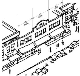
Figure 17. This building utilizes fenestration patterns of windows and awnings and roofline modulation at intervals of no more than 40 feet to reduce its architectural scale and add visual interest.
B. The residential portion of mixed-use buildings shall include at least three of the following modulation and/or articulation features at intervals of no more than 40 feet or to distinguish individual units within the building (whichever interval is less) along all facades facing a street or pedestrian-oriented space.
i. Repeating distinctive window patterns at intervals less than the articulation interval.
ii. Horizontal building modulation. Minimum depth of modulation is 2 feet and minimum width for each modulation is 4 feet if tied to a change in color or building material and roofline modulation as defined below. Otherwise, minimum depth of modulation is 10 feet (except balconies) and minimum width for each modulation is 15 feet.
iii. Change of roofline. To qualify for this measure, the maximum length of any continuous roofline shall be 40 feet and comply with the treatments below:
a. For flat roofs or facades with a horizontal eave, fascia, or parapet, the minimum vertical dimension of roofline modulation is the greater of two feet or 0.1 multiplied by the wall height (finish grade to top of wall).
b. For gable, hipped, or shed roofs – a minimum slope of 3 feet vertical to 12 feet horizontal.
c. Other roof forms consistent with the design standards herein may satisfy this standard if the individual segments of the roof with no change in slope or discontinuity are less than 40’ in width (measured horizontally).
iv. Change in building material or siding style (perhaps coordinated with horizontal building modulation and a change in color).
v. Alternative methods as approved by the Director that meet the objectives of the standards.
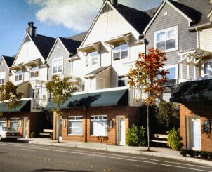
Figure 18. This mixed-use building uses repeating distinctive window patterns, modulated roofline, upper level setbacks, and a change in siding color to reduce the perceived scale of the building.
C. The maximum facade width (the facade includes the apparent width of the structure facing the street and includes required modulation) of the upper story of multi-story buildings visible from a street, public open space, or pedestrian-oriented space is 120 feet. Buildings exceeding 120 feet in width along the street front shall be divided by a 30-foot wide modulation of the exterior wall, so that the maximum length of a particular facade is 120 feet. Such modulation must be at least 20 feet or deeper and extend through all floors except the ground floor where a pedestrian-oriented facade has been provided. Decks and roof overhangs may encroach up to 3 feet (per side) into the modulation. The Director will consider other design methods that are effective at reducing the perceived width of the building.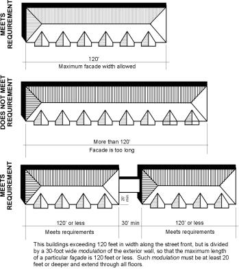
Figure 19. Maximum building facade width standards.
D. Rooflines visible from a public street, open space, or public parking area must be varied by emphasizing dormers, chimneys, stepped roofs, gables, prominent cornice or fascia, or a broke or articulated roofline. The width of any continuous flat roofline should extend no more than 100 feet without modulation. Modulation should consist of either:
i. For flat roofs or facades with a horizontal eave, fascia, or parapet, the minimum vertical dimension of roofline modulation is the greater of 2 feet or 0.1 multiplied by the wall height (finish grade to top of wall) if the segment is 50 feet or less or at least 4 feet if the segment is more than 50 feet in length.
ii. A sloped or gabled roofline segment of at least 20 feet in width and no less than 3 feet vertical in 12 feet horizontal.
iii. A combination of the above.
E. To moderate the vertical scale of multi-story buildings, the design shall include techniques to clearly define the building’s top, middle and bottom. The following techniques are suggested methods of achieving vertical articulation:
i. Top: Sloped roofs, strong eave lines, cornice treatments, horizontal trellises or sunshades, etc.
ii. Middle: Windows, balconies, material changes, railings and similar treatments that unify the building design.
iii. Bottom: Pedestrian-oriented storefronts, pedestrian scale building details, awnings, and arcades.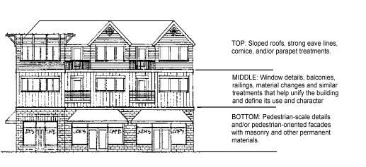
Figure 20. Utilize design techniques to clearly define a multi-story building’s top, middle, and bottom.
F. Untreated blank walls within 50’ of and visible from a public street, pedestrian pathway, public park or open space are prohibited. Treatment of blank walls is to be proportional to the wall. All of the proposed methods are subject to City approval. The applicant must submit architectural plans and elevations showing proposed treatments for approval. Methods to treat blank walls must include one or more of the following:
i. Transparent windows or doors.
ii. Display windows.
iii. Landscape planting bed at least 8’ feet wide or a raised planter bed at least 2 feet high and 3 feet wide in front of the wall with planting materials that are sufficient to obscure or screen at least 50 percent of the wall’s surface within three years.
iv. A vertical trellis in front of at least 50% of the wall with climbing vines or plant materials.
v. Artwork (mosaic, mural, sculpture, relief, etc.) over at least 50% of the blank wall surface.
vi. Other methods that meet the Objectives.
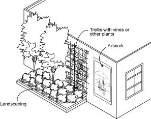
Figure 21. Blank wall treatments.
19.49.100 Building Details and Materials
1. Objectives.
A. To encourage the incorporation of design details and small scale elements into building facades that are attractive at a pedestrian scale.
B. To encourage creativity in the design of building facades to add visual interest.
C. Ensure that buildings have design integrity at all observable distances.
D. Ensure that exterior finishes are compatible with traditional main street character.
E. Enhance buildings with appropriate design details.
F. Architecturally accentuate building corners at street intersections.
G. Encourage the use of high-quality, permanent, durable, and compatible materials that will upgrade the visual image of Burien and are easy to maintain.
H. Use the architectural elements of a building and landscaping to highlight and define the entrance.
I. Reduce the apparent size of large, undifferentiated walls through the use of various architectural and landscaping treatments.
2. Design Standards.
A. All buildings shall be enhanced with appropriate details. Specifically, buildings shall include at least three of the following elements on their primary facades.
i. Decorative rooflines: For example, an ornamental molding, entablature, frieze or other roofline device visible from the ground level. If the roofline decoration is in the form of a linear molding or board, then the molding or board shall be at least 8" wide.
ii. Decorative treatment of windows and doors: For example:
a. Decorative molding / framing details around all ground floor windows and doors; molding should comply with the following:
- Wood framed windows are preferred.
- Metal framed windows shall be powder-coated; darker colors are preferred.
- Natural mill finished or clear anodized aluminum window frames are discouraged.
b. Decorative glazing, or door designs located on facades facing streets or public parks or open spaces.
c. Display windows divided into a grid of multiple panes.
d. Smaller component windows reminiscent of traditional main street vernacular when adjacent to sidewalks or other pedestrian use areas.
iii. Recessed entry.
iv. Decorative paving and artwork near entry.
v. Landscaped trellises or other decorative element that incorporates landscaping near the building entry.
vi. Decorative light fixtures with a diffuse visible light source such as a globe or “acorn” that is non-glaring.
iv. Decorative building materials, including decorative masonry, shingle, brick, tile, stone, or other materials with decorative or textural qualities as approved by the Director.
ix. Decorative pedestrian-oriented signage, such as hanging or window sign.
x. Other details that meet the Objectives.
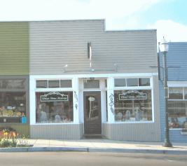
Figure 22. This building’s transom windows, display windows, recessed entry and decorative door add visual interest at a pedestrian scale
B. All commercial uses containing a secondary side or rear entrance shall incorporate at least two of the following design elements to visually enhance such entries.
i. Weather protection over the entry at least 4 1/2 feet wide in the form of awnings, marquees, canopies, or overhangs.
ii. Decorative pedestrian-oriented signage consistent with BMC 19.30 that highlights the entry and adds visual interest.
iii. Pedestrian-oriented space or designated outdoor eating areas.
iv. Fixed landscaping elements, including one of the following:
a. Landscaped planter or fixed planter box incorporating decorative ground cover, shrubs, and/or trees.
b. A trellis or other similar architectural element that incorporates landscaping.
v. Decorative pedestrian-scaled lighting fixture(s).
vi. Special building details that highlight the entry and add visual interest.
vii. Other features that meet the objectives.
All elements above shall be approved by the Director.
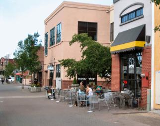
Figure 23. The secondary entrances of these businesses incorporate transparent windows and doors, decorative building elements, pedestrian-oriented signage, and a designated outdoor dining area.
C. Building exteriors shall be constructed from high quality, durable materials. Preferred exterior building materials that reflect the City’s desired traditional main street character are as follows:
i. Brick.
ii. Narrow horizontal wood siding (generally 5 inches or less); wider siding will be considered where there is a historic precedent.
iii. Other materials subject to approval by the Director.
D. The following materials are prohibited in visible locations unless an exception is granted by the Director based on the integration of the material into the overall design of the structure.
i. Vinyl or plywood siding (including T-111 or similar plywood).
ii. Highly tinted or mirrored glass (except stained glass) as a major building element.
iii. Corrugated fiberglass.
iv. Chain link fencing (except for temporary purposes such as a construction site or as a gate for a refuse enclosure).
v. Crushed colored rock/crushed tumbled glass.
vi. Non-corrugated and highly reflective sheet metal.
E. Special standards for concrete or concrete blocks (concrete masonry units or “cinder blocks”): When used for walls that are visible from a street, public park or open space, or pedestrian route, concrete or concrete block construction shall be limited to 30 percent of the facade area and architecturally treated in one or more of following ways:
i. Use of textured surfaces such as split face or grooved.
ii. Use of other masonry types such as brick, glass block, or tile in conjunction with the concrete or concrete blocks.
iii. Use of decorative coursing to break up blank wall areas.
iv. Use matching colored mortar where color is an element of architectural treatment for any of the options above.
F. Special standards for metal siding: When used for walls that are visible from a street, public park or open space, or pedestrian route, buildings shall have visible corner moldings and trim and incorporate masonry, stone, or other durable permanent material near the ground level (first 2 feet above sidewalk or ground level). Facades wider than 40 feet that employ metal siding shall incorporate multiple colors / other siding materials.
G. Special standards for Exterior Insulation and Finish System (EIFS) and other similar troweled finishes:
i. Limited to no more than 30 percent of the facade area.
ii. Shall be trimmed in wood or masonry.
iii. Should be sheltered from extreme weather by roof overhangs or other methods.
iv. Shall incorporate masonry, stone, or other durable permanent material near the ground level (first 2 feet above sidewalk or ground level).
H. The year of construction of a building shall be noted by the installation of a permanent cast metal plaque attached to the building. Stone or masonry set integral with other masonry on the front building elevation facing the principal street may be used in lieu of a cast metal plaque. The year of construction is to be noted by numbers not less than six inches high. Other information associated with the building that may have historic interest in the future may be included.
I. Street corner buildings located at Ambaum Boulevard SW and SW 151st and 152nd Street intersections shall employ two or more of the following design elements or treatments to the building corner facing the intersection.
i. Provide at least 100 square feet of pedestrian-oriented space between the building and the street corner.
ii. Provide a corner entrance.
iii. Include a corner architectural element such as:
a. Bay window or turret.
b. Roof deck or balconies on upper stories.
c. Building corner stepback “notch” or curved facade surfaces.
d. Sculpture or artwork either bas-relief, figurative, or distinctive use of materials.
e. Special weather protection feature at the corner of the building.
v. Other similar treatment or element approved by the Director.
J. A storefront’s palette should be no more than three colors; one base color, one trim color, and one accent color. Encourage trim and accent colors that contrast with the base color. Specifically, darker base colors with white trim work particularly well (see Figure 24). However, lighter base colors can effectively be combined with dark trim colors (see Figure 25).
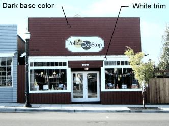
Figure 24. The use of dark base colors with white trim is encouraged on storefronts.
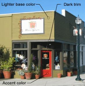
Figure 25. Lighter base colors with dark trim can also be attractive.
K. Respect existing architecture and materials such as tile and brick. These materials may not be appropriate for paint application and should be treated as the background base color theme.


